创建高 DPI Canvas 画布
时间:12-14来源:作者:点击数:
HiDPI 让一切看上去更顺畅、更清洁。 但他们也提出一系列新的挑战,以开发。 在本文中我们要看看到的独特挑战的绘制图像在画布上下文中的新的屏幕。
devicePixelRatio 属性
让我们从头开始。 回来之前我们有新的屏幕素是一个象素(如果我们忽视缩小和扩大一点),就是这样,你真的不需要改变任何东西的周围. 如果你设置的东西是100像素广泛,为所有有它。 然后在前几个新手机就开始出现了略微的神秘devicePixelRatio酒店的窗口对象和使用媒体的查询。 什么这种财产的使我们要做的就是了解的比例如何像素数值(即我们通话的逻辑素值)中说CSS将转化到 实际 的像素数设备将使用的时候呈现。 在这种情况下的4,其中有一个 devicePixelRatio 的2,你会看到一个100像素的逻辑值相当于200像素的设备的价值。
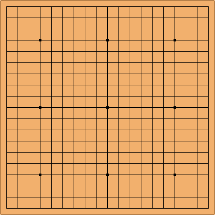
这很有趣,但是这是什么意思,为我们开发商? 在早期天我们都开始注意到我们的图像正在被提升这些设备。 我们创建图像在逻辑素宽我们的元素,当他们抽出,他们将能升级通过的 devicePixelRatio,他们会被模糊。

图1-图像正在被提升和模糊由于 devicePixelRatio
事实上解决这个已经创建图像扩大通过的 devicePixelRatio 然后使用 CSS 比例下的同样的金额,和这同样适用于画布上。
function setupCanvas(canvas) {
  // Get the device pixel ratio, falling back to 1.
  var dpr = window.devicePixelRatio || 1;
  // Get the size of the canvas in CSS pixels.
  var rect = canvas.getBoundingClientRect();
  // Give the canvas pixel dimensions of their CSS
  // size * the device pixel ratio.
  canvas.width = rect.width * dpr;
  canvas.height = rect.height * dpr;
  var ctx = canvas.getContext('2d');
  // Scale all drawing operations by the dpr, so you
  // don't have to worry about the difference.
  ctx.scale(dpr, dpr);
  return ctx;
}

// Now this line will be the same size on the page
// but will look sharper on high-DPI devices!
var ctx = setupCanvas(document.querySelector('.my-canvas'));
ctx.lineWidth = 5;
ctx.beginPath();
ctx.moveTo(100, 100);
ctx.lineTo(200, 200);
ctx.stroke();方便获取更多学习、工作、生活信息请关注本站微信公众号


推荐内容

相关内容
栏目更新
栏目热门
本栏推荐

 湘公网安备 43102202000103号