HTML CSS3+JS实现【灵动岛】效果
时间:01-27来源:作者:点击数:
主要利用CSS3-animation + JS实现效果,只是提供思路,具体细节可以参考
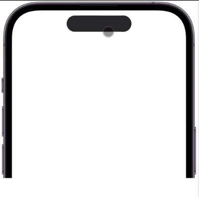
实现效果:
css3-animation属性,可实现动画效果,如下:
.demo{
  animation: 动画1,动画2;
}
上面可以实现动画效果,但是不可控制,只能自动播放,于是乎看下面:
// 灵动岛对应dom
   const box = document.querySelector(".demo");
  // 以类名定义所有动画类型,以类名切换,实现动画切换
   const animationList = ["longer", "divide", "fusion", "bigger"];
   box.addEventListener("click", () => {
     box.classList.add(animationList[index]);
   });
   let index = 0;
   // 每一个动画结束都会触发此事件(包括子元素及不同属性动画结束时)
   box.addEventListener("animationend", (e) => {
     if (
       e.animationName === "divide-right" ||
       e.animationName === "fusion-right"
     ) {
       return;
     }
     index++;
     setTimeout(() => {
       if (index <= animationList.length - 1) {
         box.classList.add(animationList[index]);
       } else {
         index = 0;
       }
     }, 800);
   });
JS控制动画的三种方式:
1.直接覆盖 animation
box.style.animation = `longer 800ms ease-in-out`;
如果动画效果较多,那就写的比较长了,建议封装CSS类,通过切换CSS类名实现动画效果
2.通过切换CSS类名,上面说过了,把不同动画封装在不同类里面,直接切换
box.classList.toggle('longer');
3.animationPlayState属性
box.style.animationPlayState="paused"
// runing播放,paused暂停。
但是只支持单动画播放
动画结束如何让界面停留在结束时的状态呢?
animation-fill-mode:forwards;
完整代码:
<!DOCTYPE html>
<html lang="en">
  <head>
    <meta charset="UTF-8" />
    <meta http-equiv="X-UA-Compatible" content="IE=edge" />
    <title>灵动岛</title>
    <style>
      * {
        margin: 0;
        padding: 0;
      }
      #iphone14pro {
        position: relative;
        margin: auto;
        width: 974px;
        height: 876px;
        overflow: hidden;
        background-image: url(https://www.cdsy.xyz/wp-content/uploads/2022/09/2022091405393859.png);
      }
      .demo {
        width: 320px;
        margin-top: 72px;
        margin: 72px auto 0;
        background-color: red;
        height: 80px;
        border-radius: 40px;
        background-color: #272729;
        position: relative;
      }
      .demo::after {
        position: absolute;
        content: " ";
        right: 0;
        width: 80px;
        height: 100%;
        border-radius: 80px;
        background-color: #272729;
      }
      /* 变长 */
      .longer {
        animation: longer 800ms ease-in-out forwards;
      }
      @keyframes longer {
        0% {
        }
        60% {
          width: 50vw;
        }
        80% {
          transform: scaleX(1.04);
        }
        100% {
          transform: scaleX(1);
          width: 50vw;
        }
      }
      /* 分离 */
      .divide {
        animation: divide-left 800ms ease-in-out forwards;
      }
      @keyframes divide-left {
        0% {
        }
        40% {
          transform: scaleX(1.1);
        }

        100% {
          transform: scaleX(1);
        }
      }
      .divide::after {
        animation: divide-right 800ms ease-in-out forwards;
      }
      @keyframes divide-right {
        0% {
        }
        40% {
          transform: scaleX(1.1);
        }

        100% {
          transform: scaleX(1);
          right: -100px;
        }
      }
      /* 融合 */
      .fusion {
        animation: fusion-left 800ms ease-in-out forwards;
      }
      @keyframes fusion-left {
        0% {
        }
        40% {
          transform: scaleX(1.1);
        }

        100% {
          transform: scaleX(1);
        }
      }
      .fusion::after {
        animation: fusion-right 800ms ease-in-out forwards;
      }
      @keyframes fusion-right {
        0% {
          right: -100px;
        }
        40% {
          transform: scaleX(1.1);
        }

        100% {
          transform: scaleX(1);
          right: 0;
        }
      }
      /* 变大 */
      .bigger {
        animation: bigger 800ms ease-in-out forwards;
      }
      @keyframes bigger {
        0% {
        }
        60% {
          width: 81vw;
          height: 400px;
          border-radius: 100px;
        }
        80% {
          transform: scaleX(1.04);
        }
        100% {
          width: 81vw;
          height: 400px;
          border-radius: 100px;
          transform: scaleX(1);
        }
      }
      .bigger::after {
        display: none;
      }
    </style>
  </head>
  <body>
    <div id="iphone14pro">
      <div class="demo"></div>
    </div>
    <script>
      // 灵动岛对应dom
      const box = document.querySelector(".demo");

      const animationList = ["longer", "divide", "fusion", "bigger"];
      box.addEventListener("click", () => {
        box.classList.add(animationList[index]);
      });
      let index = 0;
      // 每一个动画结束都会触发此事件(包括子元素及不同种类属性动画)
      box.addEventListener("animationend", (e) => {
        if (
          e.animationName === "divide-right" ||
          e.animationName === "fusion-right"
        ) {
          return;
        }
        index++;
        setTimeout(() => {
          if (index <= animationList.length - 1) {
            box.classList.add(animationList[index]);
          } else {
            index = 0;
          }
        }, 800);
      });
    </script>
  </body>
</html>
方便获取更多学习、工作、生活信息请关注本站微信公众号


 湘公网安备 43102202000103号